
Picture this: A couple is driving through a neighborhood, spots a "For Sale" sign, and immediately pulls out their phone to search for the listing.
What happens next determines whether you get a lead or lose one.
If your website loads fast, displays perfectly, and makes it easy to contact you — you win.
If it loads slowly, looks broken on mobile, or forces them to pinch and zoom — they're gone. Probably to your competitor whose site actually works.
This isn't theory. It's happening right now, hundreds of times a day in your market.
Let's talk about why responsive design isn't just a tech buzzword — it's the difference between a lead-generating machine and an expensive digital brochure.
This mobile-first behavior is exactly why modern agents invest in feature-rich platforms, similar to the must-have elements outlined in top features every real estate website must have in 2025, where responsive layouts directly impact lead capture.
The stats are staggering:
- 78% of property searches start on a mobile device
- 92% of millennials (prime buying demographic) use smartphones for initial research
- 64% of serious buyers contact agents directly from mobile
- Mobile searches convert 2.3x faster than desktop when the experience is optimized
Translation? If your site isn't mobile-optimized, you're invisible to 8 out of 10 potential clients.
But here's the kicker: luxury properties and waterfront homes attract buyers from across the country, and mobile usage spikes even higher during peak vacation seasons when out-of-town buyers are actively touring neighborhoods.
Your website isn't competing with other real estate sites anymore. It's competing with Zillow, Realtor.com, and Redfin — platforms that invested millions in mobile optimization.
The good news? You don't need millions. You just need the right approach.
According to data published by Statista’s real estate digital usage reports, mobile devices now dominate property discovery, making responsive optimization a non-negotiable requirement for serious agents.
Let's cut through the jargon.
Responsive design means your website automatically adapts to whatever device someone is using — smartphone, tablet, laptop, or desktop.
Same content. Same functionality. Different layout optimized for the screen size.
What this looks like in practice:
- Fluid grids — Images and text resize proportionally
- Flexible images — Photos scale without pixelating or breaking
- Media queries — CSS code that detects screen size and adjusts accordingly
- Touch-optimized elements — Buttons sized for thumbs, not mouse cursors
- Readable typography — Text that doesn't require zooming

Think of it like water poured into different containers — it takes the shape of whatever holds it, but it's still the same water.
Bad mobile experience: Tiny text, horizontal scrolling, broken menus, impossible-to-tap buttons.
Good mobile experience: Everything just works. Seamlessly.
Google reinforces this approach through its mobile-first indexing guidelines, where the mobile version of your site is treated as the primary ranking signal.
Here's an uncomfortable truth: 53% of mobile visitors abandon sites that take longer than 3 seconds to load.
Three. Seconds.
That's barely enough time to blink twice.
What slows sites down:
- Uncompressed images — That gorgeous 5MB hero image? Death sentence on mobile
- Render-blocking JavaScript — Code that prevents page content from displaying
- Too many HTTP requests — Every element that loads separately adds delay
- No browser caching — Making visitors re-download everything on each visit
- Cheap shared hosting — Bargain servers = sluggish performance
The real estate impact:
- A 1-second delay reduces conversions by 7%
- A 2-second delay increases bounce rate by 32%
- A 3-second delay means 40% of visitors leave before seeing anything
Let's do math: If your site gets 1,000 mobile visitors per month, and half leave due to slow loading, that's 500 lost opportunities. If just 10% would have become leads, you're losing 50 leads monthly.
At a 5% closing rate, that's 2-3 deals you never even knew about.
Speed isn't a luxury. It's survival.
Performance improvements discussed here closely align with the optimization tactics used in UX and CTA optimization strategies for real estate websites, where speed directly influences engagement and inquiry rates.
Bounce rate is the percentage of visitors who hit your site and immediately leave without clicking anything.
It's the digital equivalent of someone walking into your open house, taking one look, and walking right back out.
Average bounce rates:
- Non-responsive sites: 73% bounce rate
- Poorly responsive sites: 58% bounce rate
- Well-optimized responsive sites: 32% bounce rate
That means a properly optimized mobile site can cut your bounce rate in half.
Why mobile visitors bounce:
- Text too small to read without zooming
- Buttons too tiny to tap accurately
- Navigation menus don't work on touch screens
- Forms impossible to fill out on mobile
- Pop-ups that can't be closed
- Content blocked by intrusive ads
Google tracks bounce rate as a ranking signal. High bounce rates tell Google your site provides a poor user experience — so they rank you lower.
Lower rankings = fewer visitors = fewer leads.
It's a vicious cycle that starts with ignoring mobile optimization.
Your mouse cursor is precise. Your thumb? Not so much.
The average adult thumb pad is about 44-57 pixels wide. If your buttons are smaller than that, users will misclick constantly — and give up in frustration.
Mobile conversion killers:
- Tiny contact buttons — "Schedule Showing" link that's impossible to tap
- Close-together navigation items — Accidentally tapping the wrong page
- Small form fields — Trying to type an email address in a microscopic box
- Accidental taps — Elements too close together cause misclicks
What converts on mobile:
- Large tap targets — Minimum 48x48 pixels
- Prominent CTA buttons — "Call Now" and "Request Info" impossible to miss
- Click-to-call functionality — One tap dials your number
- Swipeable image galleries — Natural gesture-based browsing
- Simplified forms — Auto-fill enabled, minimal required fields
- Sticky contact bars — Contact options always visible while scrolling
Every extra tap required is a chance for the visitor to change their mind. Make contacting you ridiculously easy.
Google’s Core Web Vitals documentation explicitly highlights touch usability and interaction stability as ranking factors—making tap-friendly design essential for SEO as well as conversions.
Mobile devices know exactly where users are. Smart real estate sites use this data to generate instant leads.
Geo-location features that convert:
- "Homes Near Me" search — Automatically shows properties within radius
- Location-based alerts — Notify when new listings appear in their area
- Neighborhood discovery — Show what's walkable from current location
- Open house proximity — Display upcoming showings nearby
- Agent matching — Connect with specialists in their target area
Real scenario:
Tourist visiting your area. Loves the neighborhood. Opens your site on their phone. Your site detects their location, immediately shows available properties within walking distance, displays current market stats for the neighborhood, and offers a one-click option to schedule a showing during their trip.
Result? You just captured a serious out-of-state buyer who might've never contacted you otherwise.
Without geo-location? They see generic search boxes and move on to the next agent.
When paired with properly structured local landing pages built through professional real estate web development services, geo-location features dramatically increase relevance for “near me” property searches.
Let's look at actual before-and-after data from agents who upgraded to responsive, mobile-optimized websites:
| Metric | Before Optimization | After Optimization | Change |
|---|---|---|---|
| Mobile Bounce Rate | 68% | 34% | 50% decrease |
| Avg. Session Duration | 42 seconds | 3 min 18 sec | 371% increase |
| Pages Per Visit | 1.3 | 4.7 | 262% increase |
| Contact Form Submissions | 8/month | 47/month | 488% increase |
| Mobile-to-Lead Conversion | 1.2% | 4.8% | 300% increase |
Case study: Waterfront Property Specialist
Agent specializing in luxury waterfront properties invested in mobile optimization. Within 90 days:
- Mobile traffic increased 156%
- Generated 23 qualified buyer leads from mobile
- Closed 4 deals directly attributed to mobile inquiries
- Combined commission: $127,000
Website investment? $8,500.
ROI: 1,394%
Many of these results are consistent with industry-wide benchmarks published by the National Association of Realtors, which confirms mobile experience as a key driver of buyer engagement.
Even sites that claim to be "mobile-friendly" often make critical errors:
Mistake #1: Mobile Afterthought
Designing for desktop first, then trying to cram everything onto mobile screens. This always fails. Start mobile-first, then enhance for larger screens.
Mistake #2: Ignoring Thumb Zones
Placing critical buttons at the top of the screen where they're hard to reach. Most users hold phones one-handed — optimize for thumb-friendly lower sections.
Mistake #3: Too Much Content Above the Fold
Cramming headlines, images, text, and CTAs all before users scroll. Mobile screens are small — prioritize ruthlessly.
Mistake #4: Broken Forms
Desktop-optimized forms with tiny fields, no auto-complete, required fields not marked, no validation feedback. Result? 90% form abandonment.
Mistake #5: Auto-Playing Videos
Nothing kills mobile experience faster than unexpected video/audio. Users are often browsing in quiet places — let them control media playback.
Mistake #6: Flash or Outdated Tech
Using plugins or technologies mobile browsers don't support. If it requires Flash, Java, or Silverlight — it's dead on mobile.
Mistake #7: No Testing on Real Devices
Your site might look fine in Chrome's mobile emulator but break on actual iPhones or Androids. Test on physical devices before launch.
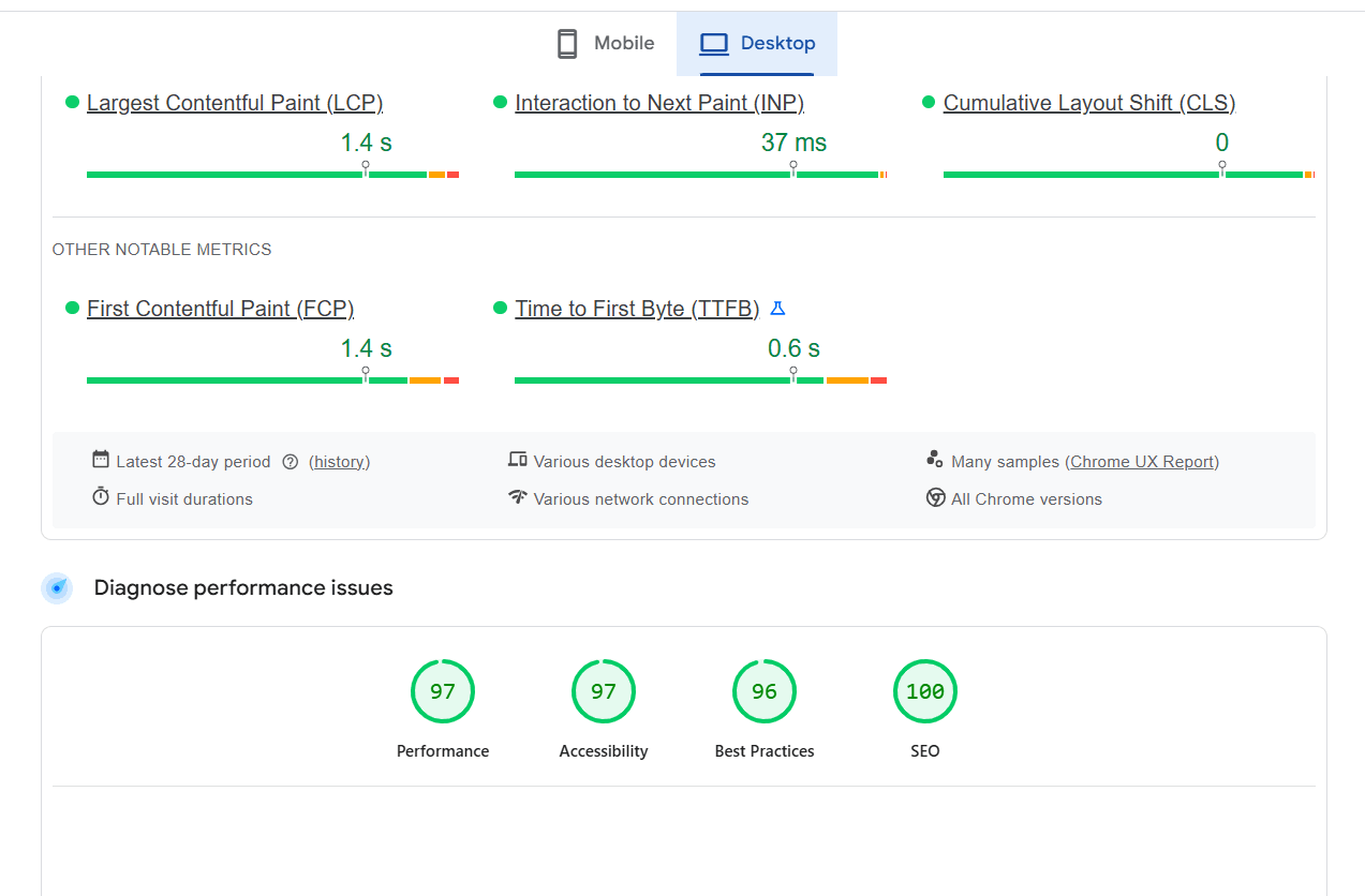
Want to know exactly how your site performs on mobile?
Qaushik Labs offers a complimentary, no-obligation website performance audit that reveals:
- Mobile load speed analysis — How fast (or slow) your site loads on smartphones
- Responsive design grade — How well your layout adapts to different screens
- User experience assessment — Specific issues preventing conversions
- Touch-target evaluation — Whether buttons and links are easy to tap
- Core Web Vitals report — Google's performance benchmarks
- Competitor comparison — How you stack up against top agents in your market
- Actionable recommendations — Prioritized list of improvements
What you'll receive:
- Detailed PDF report with screenshots and data
- 15-minute consultation to review findings
- Custom optimization roadmap
- Zero pressure — no obligation to hire us
This audit normally costs $500, but it's completely free for real estate professionals who book in the next 30 days.
We'll show you exactly what's working, what's broken, and what opportunities you're missing.
Agents in competitive markets often combine mobile audits with real estate website development services in Gurgaon to improve both performance metrics and local visibility simultaneously.
The real estate game has changed.
Buyers aren't waiting until they get home to browse listings. They're searching while driving through neighborhoods, sitting in cafes, waiting in doctors' offices, lying in bed at night.
Your website is their first impression of you.
If that impression is slow, clunky, and frustrating — they're gone. And they're not coming back.
But if your site loads instantly, displays beautifully, and makes contacting you effortless — you've just won a lead that your competitors never had a chance at.
The data doesn't lie:
- Mobile-optimized sites generate 488% more leads
- Fast-loading pages convert 300% better
- Responsive design cuts bounce rates in half
Every day you wait is another day of lost opportunities.
Don't let a slow, outdated website cost you another deal.
Get your free performance audit and discover exactly how to turn your website into your best lead generator.
For agents scaling online acquisition, responsive design works best when integrated with a broader digital foundation, including end-to-end digital marketing services that support traffic growth, performance, and lead nurturing together.
Ready to Transform Your Digital Presence?
Let Qaushik Labs help you implement growth-focused solutions for your business. From websites and SEO to ads and automation, we’re here to help you generate better leads and revenue.
Get Started TodayResponsive web design means your real estate website automatically adapts its layout, images, and functionality to work perfectly on any device — smartphones, tablets, laptops, and desktops. Instead of building separate sites for each device type, one responsive site fluidly adjusts to provide an optimal viewing experience regardless of screen size.
Mobile optimization increases leads by reducing bounce rates, improving user experience, and making it easier for prospects to contact you. When your site loads quickly and displays perfectly on smartphones, visitors stay longer, browse more listings, and are significantly more likely to fill out contact forms or call you directly. Our clients typically see 300-400% increases in mobile lead generation after optimization.
For real estate websites, aim for under 2 seconds on mobile devices. Google recommends under 3 seconds, but since 53% of mobile users abandon sites slower than 3 seconds, faster is always better. Every additional second of delay can reduce conversions by 7%, so speed directly impacts your bottom line.
Use Google's Mobile-Friendly Test tool, check Core Web Vitals in Google Search Console, or request a professional audit. Better yet, test on actual devices — borrow friends' phones and tablets to see how your site really performs. Qaushik Labs offers free comprehensive performance audits that identify specific issues and opportunities.
For most real estate agents, a properly optimized responsive website is more than sufficient and much more cost-effective than building and maintaining a separate app. Responsive sites work across all devices without requiring downloads, updates, or app store approval. Apps make sense for large brokerages with dedicated development teams, but individual agents get better ROI from excellent responsive sites.
If building from scratch, expect $3,000-$12,000 for a professional responsive real estate site. Converting an existing non-responsive site typically costs $2,000-$6,000 depending on complexity. At Qaushik Labs, we offer flexible packages starting at $3,500 for complete mobile optimization including speed improvements, responsive design, and conversion optimization.